An In-Depth Creative Process For Updating a Logo
A Fresh New Look for Taste of Marietta
- An in-depth peek at one creative process here at SNMD
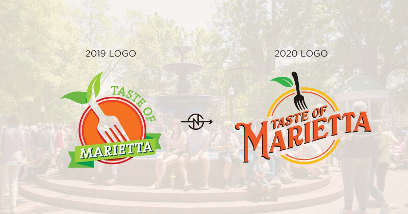
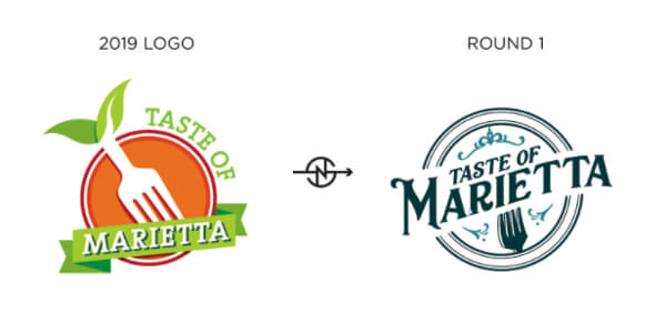
The Taste of Marietta is a food festival where one can sample a variety of Cobb County’s restaurants, as well as experience Marietta’s history, culture, and shopping. The Marietta Visitors Bureau hired SNMD for a wide variety of services, but my specific job was designing a fresh new look for the festival. With every rebrand, you always want to start at the heart of the brand which is the logo and then expand that essence outward into other areas. For now, I’m just going to focus on the logo. If you want the gist of it, take a look at the image below. For some more nitty-gritty keep on keepin’ on.
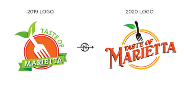
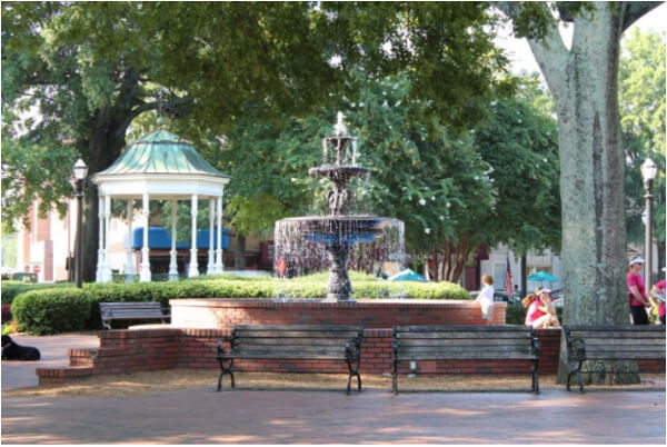
The Marietta Visitors Bureau wanted the new logo to really taste like Marietta. So I took the 2019 logo, marinated it in some twang and threw that sucker into an antique smoker for 17 hours. Yummy. I kid I kid, if you are familiar with Marietta you would agree that it is a very townsey town city. Real mom & pop shops with history and personality. If I had to use one word to describe Marietta it would be vintage.
Which made it very easy when choosing a new font as vintage display fonts are all the rage. From there it was a matter of finessing the type into a more dynamic raised lockup, bringing in food elements, and choosing some colors. For food elements, I definitely wanted to keep the fork and figured a circular background holding shape could suggest a plate. The 2019 fork looks plastic due to the rounded edges and flat perspective. I wanted to update the fork to something you are more likely to find in one of Marietta’s restaurants. So by slightly sharpening the edges and adding curvature, you get this:
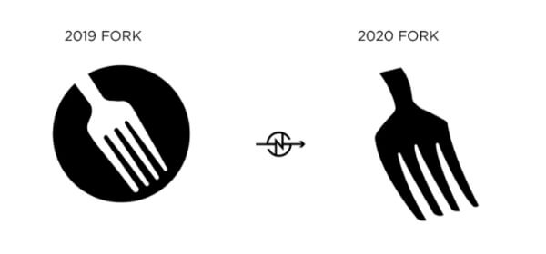
Not necessarily a fancy pants fork but something that could definitely handle that giant bite of brisket you desire. For the holding shape, I put some thick circles with thinner inner circles to represent the raised lip of a plate. I don’t know the correct term, but I’m sure you’re familiar with plates. Also added some flourishes reminiscent of grandma’s chinaware that no one was ever allowed to use to really make you feel at home. Ended up with the winner of round 1.
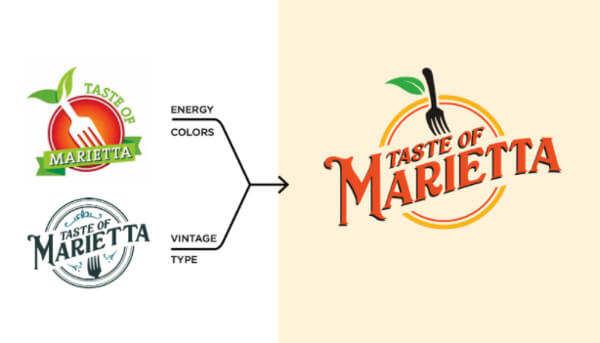
As most projects go, this one still needed a lot of work after round 1. Our client wanted to bring back elements of the 2019 logo to retain brand recognition while keeping the vintage feel we provided. Making a vintage comfy logo simultaneously be modern & energetic is just about as hard as it sounds, but it’s our job to work through these oxymorons. So I added the slow-cooked round 1 logo into the bone broth of the 2019 logo & baby we had a stew going. Those flavors got to know each other in a way that felt right. Improved the fork/fruit concept, refined the colors, and reduced our jumbled thoughts into a palatable graphics to explain our creative process. We had a winner.
As for logo creation that’s simply one path traveled. The creative process is going to be different every time, and this was only one of three logos that came from even more unfinished logos. Each had its own process and challenges. You can check out the three-round 1 contenders below. Bon appetit!